Recommended by Dr Arthur CW Lau on 20 April 2010

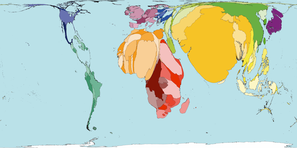
Figure. Pneumonia deaths cartograms generated by Worldmapper. Territories are sized in proportion to the absolute number of people who died from lower respiratory infection in one year.
Worldmapper is a collection of world maps according to the subject of interest using equal area cartograms where territories are re-sized on each map according to a particular variable. From the SASI Group (University of Sheffield) and Mark Newman (University of Michigan).
Weblink here
Welcome to Hong Kong Society of Critical Care Medicine
Phone call
(852)-3505-1313
Email Us
secretary@hksccm.org
Working Time
Mon - Fri: 9:00 - 17:30